A Look at the Artistic Side of Webcomics
Now first, it should be known that I am not an artist. I never claimed to be an artist. The only art experience I have is art class in middle and elementary schools and random doodles I sometimes do when I'm supposed to be listening to lectures. I prefer drawing abstract because in my mind it takes less effort to make it look good. Sometimes I do cartoony things. Sometimes I try to draw more realistically I'm not going to try to guess how good I am at realistic drawings.
I do not even try to take art seriously. It's not for me. When I read comics, I read the words. I just gloss over the art, so those big splash pages that some comics like to use take less than a half second for me to read and take in. It appeals to me that much.
Still, I am reviewing comics, and half of comics is the art behind it, so I guess I should actually start paying attention to it. However, to properly review art, I have to actually know a few things about drawing properly. I decided to learn by teaching myself because that is much more effective than taking a class.
I've decided for my first picture I would draw a group shot of characters from the webcomics I read waving to the audience. Since this is just practice, I decided to forgo planning and just start drawing. I think I got everybody. Choo-Choo Bear might be on there twice, but hey, what can you do. I wanted to include him in the picture. He's a little bit easier to draw.
Here's the pencil for you.
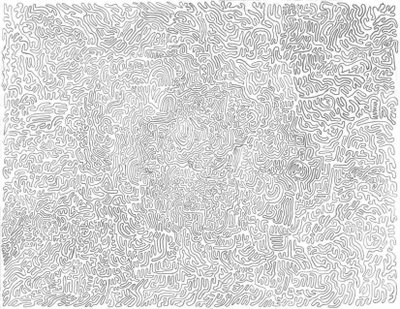 (All characters belong to their creators.)
Now I understand my line may not be at "strong," or whatever you say, as someone who has been drawing for longer than I have. Just bear with me. I'm new.
I must admit, this is not how the drawing came out of the scanner. There were a few smudges on it, so I decided to clean it. To clean I used this little program called MS Paint and the eraser tool, as well as the white pencil. It was a little bit frustrating, but I persevered for my art.
So anyway, I heard somewhere that all true artists always ink their work. I also heard something about erasing the pencil lines, but I forgot when and how that was supposed to happen, so I just left the pencils under the ink. I hope you can forgive me.
My tool of choice was a Bic pen, since they were readily available. Afterward I did a little cleaning. The end result can be seen here.
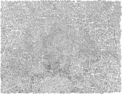
Now the first thing that can be seen here is that the lines are much darker when you use a pen. However, cleaning the picture was a real pain. In fact, I didn't quite get all the cleaning done because I just gave up, so you can still see a few smudges where I just decided to leave it be.
So let's recap.
Advantages for pencils
Less work
Easy cleanup
Ability to correct errors
Advantages for pens
Darker lines
More defined shapes
Sense of professionalism
So it's three against three, which would suggest that neither is better than the other, although that professionalism might count for something. Then again, we're drawing webcomics. That's about as far away from professional as we can get.
I want to try one more thing before I end this article because I hear that shading can add a lot to your work. Shading, if I have it right, is filling in your outlines with either colors or blacks to add depth to your work. Depth sounds like a good thing. Three dimensionality is always good.
I decided to go with a simple shading. No cross-hatching, since I still don't quite know what cross hatching is. I decided to take my trusty Bic pen and fill in the out lines in the picutre. Really simple, and I think it will make the shapes really pop out of the picture, which is what I'm going for, right.
I decided not to clean this one because I was feeling lazy.
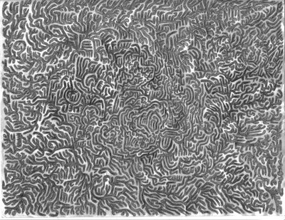
So there you go, a nice black and white drawing for your viewing pleasure, and this one doesn't look to bad with the smudges left in. I think it's the shading.
But really, let's look at what I've done objectively.
What we have here is basically a doodle, a bunch of random lines on a piece of paper that follows some sort of rules. It's not a great artistic acheivement. It probably has been done before and better. It's not really that interesting. There's no color. It really doesn't say much about anything.
But you know what? It's my doodle, and I think it's the coolest thing in the world. I still think it's the coolest thing knowing everything I wrote in the previous paragraph and knowing that I went through the process wrong at almost every step because it my doodle, and anyone who says otherwise, I just won't listen to. All hail the mighty doodle.
And that's why I don't review art.
posted by Andrew Araki at 12:05 PM
![]()

3 Comments:
Scanning makes a huge difference. When I first started, my scanning abilities sucked. So my comic didn't look so great.
It wasn't that I was a terrible artist, per se... just that I didn't know how to make the picture look better in the scanner.
Also, varying line thickness is important and i didn't attempt to do that back then either.
Nowadays, I think my art is a lot more interesting.
I'm willing to fill out the backgrounds, use textures and colours, and I've finally discoverd a brightness/contrast mode that allows the lines to be seen well after scanning (which is half the battle)
I have that thing with art- I do notice it, but it's not the biggest thing in the world, which is probably why I love dinosaur comics so much.
Now that's my kind of art! I like the pen one best. I'm sure if I stare long enough I'll see the group picture there...
(Actually, it looks a bit like Station V3 with the reality normalizer turned off...)
Post a Comment
<< Home